Navigation Style and Theme

This section of the Android Navigation SDK guide discusses the process of customizing the Navigation Style and Theme to suit the unique branding and visual identity of the application. It covers a range of topics, such as attributes, Navigation View anatomy, attribute-to-UI mapping, and customization of styles, colors, and icons. Through this section, developers can acquire knowledge on how to apply custom styles and themes to the Navigation UI, enabling them to create a unique and personalized experience for users.

Attributes

This is a list of attributes that can be used to customize the appearance of a navigation view in an application that utilizes the NextBillion.ai Navigation SDK. Each attribute has a unique number, name, and type. The attributes are organized into six groups:

  • Navigation View: The Navigation View attributes allow developers to customize the primary and secondary colors, text color and accent color.

  • Instruction List: Instruction List attributes allow developers to customize the background color, primary and secondary text color and primary and secondary maneuver color.

  • Banner: Banner attributes allow developers to customize the background color, secondary background color, primary and secondary text color, primary and secondary maneuver color.

  • Sound button: Sound button attributes allow developers to customize the color and background color of the sound button.

  • Speedometer: Speedometer attributes allow developers to customize the background color, text color and unit text color of the speedometer.

  • Others: Other attributes allow developers to customize the appearance of the destination marker, route overview, recenter background, recenter info color, user location style, route style, and map style.

To learn more about attributes in Android, please refer to the Android official docs: Styles and Themes and Create a view class.

  • Navigation View: The Navigation View attributes allow developers to customize the primary and secondary colors, text color and accent color.
No.Attribute NameType
1navViewPrimarycolor
2navViewSecondarycolor
3navViewAccentcolor
4navViewPrimaryTextcolor
5navViewSecondaryTextcolor
  • Instruction List: Instruction List attributes allow developers to customize the background color, primary and secondary text color and primary and secondary maneuver color.
No.Attribute NameType
6navViewListBackgroundcolor
7navViewListPrimarycolor
8navViewListSecondarycolor
9navViewListManeuverPrimarycolor
10navViewListManeuverSecondarycolor
  • Banner: Banner attributes allow developers to customize the background color, secondary background color, primary and secondary text color, primary and secondary maneuver color.
No.Attribute NameType
11navViewBannerBackgroundcolor
12navViewBannerSecondaryBackgroundcolor
13navViewBannerPrimaryTextcolor
15navViewBannerManeuverPrimarycolor
16navViewBannerManeuverSecondarycolor
  • Sound button: Sound button attributes allow developers to customize the color and background color of the sound button.
No.Attribute NameType
17navViewSoundColorcolor
18navViewSoundBackgroundColorcolor
  • Speedometer: Speedometer attributes allow developers to customize the background color, text color and unit text color of the speedometer.
No.Attribute NameType
19navigationCurrentSpeedBackgroundColorcolor
20navigationCurrentSpeedTextColorcolor
21navigationCurrentSpeedUnitTextColorcolor
  • Others: Other attributes allow developers to customize the appearance of the destination marker, route overview, recenter background, recenter info color, user location style, route style, and map style.
No.Attribute NameType
22navDestinationMarkerdrawable
23navViewRouteOverviewDrawabledrawable
24navViewRouteOverviewBackgroundcolor
25navViewRouteOverviewDrawabledrawable
26navigationViewReCentreInfoColorcolor
27navViewUserLocationStylestyle
28navViewRouteStylestyle
29navViewMapStyleString

To learn more about attributes in Android, please refer to the Android official docs: Styles and Themes and Create a view class. These attributes give developers a high degree of control over the appearance of the navigation view, enabling them to create a visually pleasing and user-friendly navigation experience that is fully consistent with the branding and design of their application.

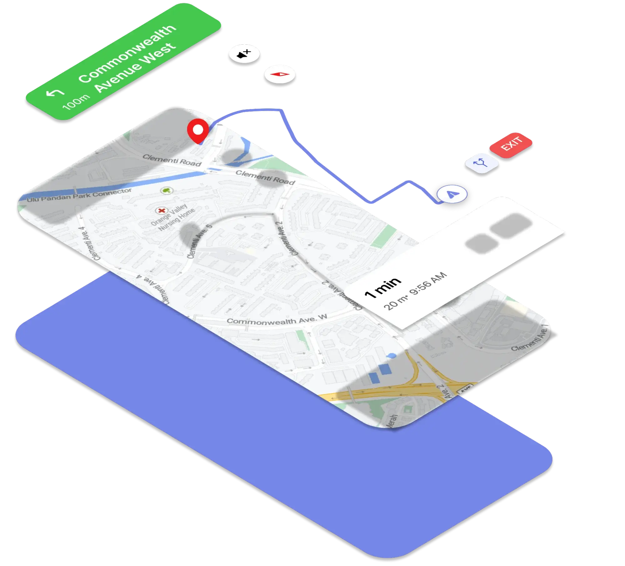
Anatomy of the Navigation View

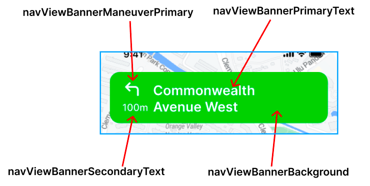
This is an anatomy of the Navigation View in an application that utilizes the NextBillion.ai Navigation SDK. The navigation view is broken down into several components, each of which can be customized using specific attributes. These attributes are organized into groups such as Banner, Bottom Summary, Recenter button, Sound button, Route line, Destination Marker, User location, Instruction list, Map Style and Speedometer. Each component has a unique number, example, and description.

For example, the Banner component, which displays the current step and maneuver, can be customized using attributes such as navViewBannerBackground, navViewBannerPrimaryText, navViewBannerManeuverPrimary and navViewBannerSecondaryText.

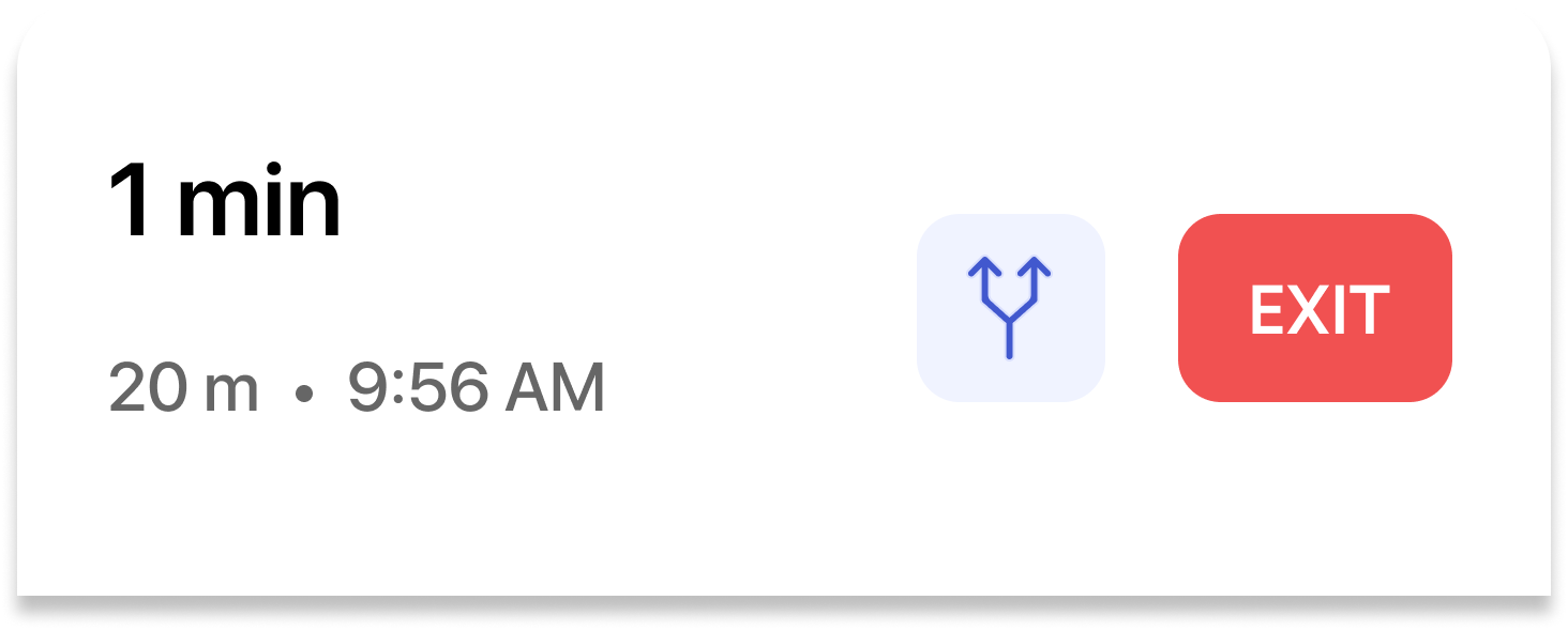
The Bottom Summary component, which displays the remaining time and distance, can be customized using attributes such as navViewPrimary, navViewRouteOverviewBackground, and navViewSecondaryText. The Recenter button component can be customized using the navigationViewReCentreInfoColor attribute. The Sound button component can be customized using attributes such as navViewSoundColor, navViewSoundBackgroundColor, navViewSoundColor and navViewSoundColor. The Route line component can be customized using attributes such as navViewRouteStyle, routeColor, routeShieldColor and routeScale.

The Destination Marker, User location, Instruction list, Map Style and Speedometer components can also be customized using specific attributes. To understand what and how we can modify in the navigation view, let’s break it down into pieces:

docs-image

No.

Example

Description

Attribute

1

Banner

Background color: navViewBannerBackground

1.1

Commonwealth Avenue West

Primary step

navViewBannerPrimaryText

1.2

Manuever Icon

navViewBannerManeuverPrimary

1.3

100m

Distance text

navViewBannerSecondaryText

1.4

Then step instruction Then step text

1.4.1 Background color:
navViewBannerSecondaryBackground
1.4.2 Step text:
navViewBannerSecondaryText

1.5

Turn lanes

2

Bottom Summary BackGroud Color

navViewPrimary

2.1

Route Preview

navViewRouteOverviewBackground
navViewRouteOverviewDrawable

2.2

Exit

(TBD)

2.2

1 min

Remaining time

navViewPrimaryText

2.2

20 m . 9:56 AM

Remaining distance & Arrival time

navViewSecondaryText

3

Recenter button Recenter text

navigationViewReCentreInfoColor

4

Sound button

navViewSoundColor navViewSoundBackgroundColor

4.1

Sound button text

navViewSoundColor

4.2

Sound button text

navViewSoundColor

5

Route line

navViewRouteStyle 5.0.1 route color:           routeColor 5.0.2 route shield color:           routeShieldColor 5.0.3 route scale:           routeScale

5.1

Maneuver arrow

 ​​maneuverArrowColor maneuverArrowBorderColor

6

Destination Marker

navDestinationMarker

7

User location

navViewUserLocationStyle -> nbmap_LocationComponent -> nbmap_gpsDrawable

8

Instruction list

navViewListBackground

8.1

Instruction list item text

navViewListPrimary navViewListSecondary

8.2

Instruction list item maneuver

navViewListManeuverPrimary navViewListManeuverSecondary

9

Map Style

navViewMapStyle

10

Speedometer

navigationCurrentSpeedBackgroundColor

10.1

63

Driving speed

navigationCurrentSpeedTextColor

10.2

km/h

Speed unit

navigationCurrentSpeedUnitTextColor

These attributes give developers a high degree of control over the appearance of the navigation view, enabling them to create a visually pleasing and user-friendly

Mapping between attributes and UI

This is a mapping between attributes and the User Interface (UI) of NavigationView. The table lists various attributes and their corresponding UI components that they affect. For example, the attribute navViewPrimary is used to customize the background color of the Bottom Summary, Sound button and the attribute navViewSecondary is used to customize the Sound button text.

This table helps developers to easily identify which attribute they should use to customize a specific part of the UI. By using these attributes, developers can easily control the visual appearance of the navigation view and create a user-friendly and visually pleasing navigation experience that is consistent with the branding and design of their application.

No.

Attributes

UI

1

navViewPrimary

Bottom summary background
Feedback button
Sound button
Wayname text background
Feedback bottom sheet background

2

navViewSecondary

Sound btn text

3

navViewAccent

Re-center Icon
Re-center text
WayName text

4

navViewPrimaryText

Time remaining in bottom summary

5

navViewSecondaryText

Distance remaining in bottom summary
Arrival time in bottom summary

6

navViewListBackground

Instruction list
then-instruction
turn lane view
sub-banner background

7

navViewListPrimary

Primary step text in bottom list
Maneuver icon in bottom list

8

navViewListSecondary

Distance text in instruction list
Secondary step text in instruction list

9

navViewBannerBackground

Banner instruction
Rerouting layout

10

navViewBannerSecondaryBackground

Then step
Turn lanes

11

navViewBannerPrimaryText

Primary step(Banner and List)
Rerouting text
Alert text

12

navViewBannerSecondaryText

Step distance
Secondary step
Then step text

13

navViewBannerManeuverPrimary

Maneuver Icon in banner
Turn lane icon
Then step turn lane icon

14

navViewBannerManeuverSecondary

Secondary part of a Maneuver Icon
Secondary part of a Turn Lane Icon(straight in Right only, right in Straight only)
Secondary part of a then step turn lane icon

15

navViewSoundColor

Sound button color

16

navViewSoundBackgroundColor

Sound button background color

17

navDestinationMarker

18

navViewRouteOverviewDrawable

19

navViewRouteOverviewBackground

Overview background color

20

navigationViewReCentreBackgroundDrawable

21

navigationViewReCentreInfoColor

Re-center Icon
Re-center text

22

navViewUserLocationStyle

Style of user location

23

navViewRouteStyle

See next section

24

navViewMapStyle

Style of base maps

25

navigationCurrentSpeedBackgroundColor

Speedometer background color

26

navigationCurrentSpeedTextColor

The text color of the current driving speed

27

navigationCurrentSpeedUnitTextColor

Speed unit text color of the current driving speed

28

navViewListManeuverPrimary

Instruction list maneuver primary

29

navViewListManeuverSecondary

Instruction list maneuver secondary

The Navigation SDK has a "NavigationMapRoute" styleable that allows developers to customize the colors and appearance of the primary route, alternative route, dashed route, dissolved route, wayname chip, and waypoint drawables. The attributes include route color, route congestion color, route shield color, alternative route color, route scale, alternative route scale, maneuver arrow color, line cap, off route dot color, and more. Developers can define these attributes in a style resource file and apply it to the NavigationMapRoute element in the layout file.

1
<declare-styleable name="NavigationMapRoute">
2
<!-- Primary route colors -->
3
<attr name="routeColor" format="color" />
4
<attr name="routeModerateCongestionColor" format="color" />
5
<attr name="routeSevereCongestionColor" format="color" />
6
<attr name="routeShieldColor" format="color" />
7
8
9
<!-- Alternative route colors -->
10
<attr name="alternativeRouteColor" format="color" />
11
<attr name="alternativeRouteModerateCongestionColor" format="color" />
12
<attr name="alternativeRouteSevereCongestionColor" format="color" />
13
<attr name="alternativeRouteShieldColor" format="color" />
14
15
16
<attr name="routeFloatDurationBackgroundPrimary" format="color" />
17
<attr name="routeFloatDurationTextPrimary" format="color" />
18
<attr name="routeFloatDurationBackgroundAlternative" format="color" />
19
<attr name="routeFloatDurationTextAlternative" format="color" />
20
21
22
<attr name="routeWayNameTextColor" format="color"/>
23
<attr name="routeWayNameBackGroundColor" format="color"/>
24
25
26
<!-- Dash line colors -->
27
<attr name="dashLineColor" format="color" />
28
29
30
<!-- Origin/Destination waypoint drawables -->
31
<attr name="originWaypointIcon" format="reference" />
32
<attr name="destinationWaypointIcon" format="reference" />
33
34
35
<!-- Route Scales -->
36
<attr name="routeScale" format="float" />
37
<attr name="alternativeRouteScale" format="float" />
38
<attr name="dashLineScale" format="float" />
39
40
41
<attr name="maneuverArrowColor" format="color" />
42
<attr name="maneuverArrowBorderColor" format="color" />
43
44
45
<!-- Rounded route line cap -->
46
<attr name="roundedLineCap" format="boolean" />
47
48
49
<attr name="offRouteDotColor" format="color" />
50
<attr name="navigationDissolvedRouteColor" format="color" />
51
<attr name="navigationDissolvedAnimatedRouteColor" format="color" />
52
</declare-styleable>

we can categorize the attributes into these groups:

  • Primary route line

  • alternative route line

  • dashed route line

  • dissolved route line

  • wayname chip

  • waypoint drawables

  • Route scales

  • maneuver arrow

  • line cap

  • off route dot

A minimum example as below:

1
<style name="xxx">
2
...
3
<attr name="routeColor" format="color"/>
4
<attr name="routeModerateCongestionColor" format="color"/>
5
<attr name="routeSevereCongestionColor" format="color"/>
6
<attr name="routeShieldColor" format="color"/>
7
<attr name="routeScale" format="float"/>
8
<attr name="alternativeRouteScale" format="float"/>
9
...
10
</style>

A style reference to customize the location component, location component is a part of the Maps SDK. The nbmap_LocationComponent is a styleable attribute that allows developers to customize the appearance of the location component in the Maps SDK. The attribute contains various options such as foreground and background drawables, tint colors, accuracy settings, and animation settings for the location icon, accuracy circle, and compass. Developers can also set options such as stale state timeout, icon padding, and layer configuration. Additionally, they can set options such as icon scale based on map zoom levels, camera tracking settings, and animation duration multiplier.

1
<declare-styleable name="nbmap_LocationComponent">
2
<attr name="nbmap_foregroundDrawable" format="reference" />
3
<attr name="nbmap_foregroundTintColor" format="color" />
4
<attr name="nbmap_backgroundDrawable" format="reference" />
5
<attr name="nbmap_backgroundTintColor" format="color" />
6
<attr name="nbmap_bearingDrawable" format="reference" />
7
<attr name="nbmap_bearingTintColor" format="color" />
8
<attr name="nbmap_gpsDrawable" format="reference" />
9
10
11
<attr name="nbmap_foregroundDrawableStale" format="reference" />
12
<attr name="nbmap_foregroundStaleTintColor" format="color" />
13
<attr name="nbmap_backgroundDrawableStale" format="reference" />
14
<attr name="nbmap_backgroundStaleTintColor" format="color" />
15
16
17
<attr name="nbmap_accuracyAlpha" format="float" />
18
<attr name="nbmap_accuracyColor" format="color" />
19
20
21
<attr name="nbmap_elevation" format="dimension" />
22
23
24
<!-- Stale state -->
25
<attr name="nbmap_enableStaleState" format="boolean" />
26
<attr name="nbmap_staleStateTimeout" format="integer" min="0" />
27
28
29
<!-- Location icon padding -->
30
<attr name="nbmap_iconPaddingLeft" format="integer" />
31
<attr name="nbmap_iconPaddingTop" format="integer" />
32
<attr name="nbmap_iconPaddingRight" format="integer" />
33
<attr name="nbmap_iconPaddingBottom" format="integer" />
34
35
36
<!-- Map layer configuration -->
37
<attr name="nbmap_layer_above" format="string" />
38
<attr name="nbmap_layer_below" format="string" />
39
40
41
<!-- Icon scale based on map zoom levels -->
42
<attr name="nbmap_maxZoomIconScale" format="float" />
43
<attr name="nbmap_minZoomIconScale" format="float" />
44
45
46
<!-- Camera tracking settings -->
47
<attr name="nbmap_trackingGesturesManagement" format="boolean" />
48
<attr name="nbmap_trackingInitialMoveThreshold" format="dimension" />
49
<attr name="nbmap_trackingMultiFingerMoveThreshold" format="dimension" />
50
51
52
<!-- Animation duration multiplier -->
53
<attr name="nbmap_trackingAnimationDurationMultiplier" format="float" />
54
55
56
<!-- Compass animation -->
57
<attr name="nbmap_compassAnimationEnabled" format="boolean" />
58
59
60
<!-- Accuracy animation-->
61
<attr name="nbmap_accuracyAnimationEnabled" format="boolean" />
62
63
64
<!-- Pulsing circle -->
65
<attr name="nbmap_pulsingLocationCircleEnabled" format="boolean" />
66
<attr name="nbmap_pulsingLocationCircleFadeEnabled" format="boolean" />
67
<attr name="nbmap_pulsingLocationCircleColor" format="color" />
68
<attr name="nbmap_pulsingLocationCircleDuration" format="float" />
69
<attr name="nbmap_pulsingLocationCircleRadius" format="float" />
70
<attr name="nbmap_pulsingLocationCircleAlpha" format="float" />
71
<attr name="nbmap_pulsingLocationCircleInterpolator" format="string" />
72
73
74
</declare-styleable>

the default style of location component

1
<style name="nbmap_LocationComponent">
2
<item name="nbmap_foregroundDrawable">@drawable/nbmap_user_icon</item>
3
<item name="nbmap_backgroundDrawable">@drawable/nbmap_user_stroke_icon</item>
4
<item name="nbmap_bearingDrawable">@drawable/nbmap_user_bearing_icon</item>
5
<item name="nbmap_gpsDrawable">@drawable/nbmap_user_puck_icon</item>
6
7
8
<item name="nbmap_foregroundDrawableStale">@drawable/nbmap_user_icon_stale</item>
9
<item name="nbmap_backgroundDrawableStale">@drawable/nbmap_user_stroke_icon</item>
10
11
12
<item name="nbmap_accuracyAlpha">0.15</item>
13
<item name="nbmap_accuracyColor">@color/nbmap_location_layer_blue</item>
14
15
16
<item name="nbmap_elevation">12dp</item>
17
18
19
<item name="nbmap_enableStaleState">true</item>
20
<item name="nbmap_staleStateTimeout">30000</item>
21
22
23
<!-- Location icon padding -->
24
<item name="nbmap_iconPaddingLeft">0</item>
25
<item name="nbmap_iconPaddingTop">0</item>
26
<item name="nbmap_iconPaddingRight">0</item>
27
<item name="nbmap_iconPaddingBottom">0</item>
28
29
30
<!-- Location icon scale based on map zoom levels -->
31
<item name="nbmap_maxZoomIconScale">1</item>
32
<item name="nbmap_minZoomIconScale">0.6</item>
33
34
35
<!-- Camera tracking settings -->
36
<item name="nbmap_trackingGesturesManagement">false</item>
37
<item name="nbmap_trackingInitialMoveThreshold">@dimen/nbmap_locationComponentTrackingInitialMoveThreshold</item>
38
<item name="nbmap_trackingMultiFingerMoveThreshold">@dimen/nbmap_locationComponentTrackingMultiFingerMoveThreshold</item>
39
40
41
<!-- Location pulsing circle -->
42
<item name="nbmap_pulsingLocationCircleEnabled">false</item>
43
<item name="nbmap_pulsingLocationCircleFadeEnabled">true</item>
44
<item name="nbmap_pulsingLocationCircleColor">@color/nbmap_location_layer_blue</item>
45
<item name="nbmap_pulsingLocationCircleDuration">2300</item>
46
<item name="nbmap_pulsingLocationCircleRadius">35</item>
47
<item name="nbmap_pulsingLocationCircleAlpha">0.4</item>
48
<item name="nbmap_pulsingLocationCircleInterpolator">decelerate</item>
49
50
</style>

navViewMapStyle is an attribute used to configure the base map's style in the Navigation SDK. It is a string value that corresponds to a Mapbox Style, which can be customized as per the user's needs. This attribute is typically included in a style resource file and can be set to any valid Mapbox style URL or local style file. A string value to configure the base map's style(Mapbox's Style https://docs.mapbox.com/help/glossary/style/)

In the example provided, the attribute is being set within a custom style called "CustomisedNavigationViewLight" which extends the "NavigationViewLight" style.

1
<style name="CustomisedNavigationViewLight" parent="NavigationViewLight">
2
...
3
<item name="navViewMapStyle">@string/xxx</item>
4
...
5
</style>

An example of a Navigation Theme

Example Style This is an example of a custom theme for the NavigationView in the Navigation SDK. It extends the "Theme.AppCompat.Light.NoActionBar" parent theme and overrides various color and drawable attributes for the various elements of the NavigationView, such as the primary and secondary colors, text colors, banner background, route style, map style, sound button colors, location layer style and destination marker. Additionally, it also includes the attributes for the location speedometer like background color, text color, and unit text color. Developers can use this theme as a starting point to customize the appearance of the NavigationView to match their desired look and feel.

1
<style name="navViewLight" parent="Theme.AppCompat.Light.NoActionBar">
2
<item name="navViewPrimary"> @color/placeholder</item>
3
<item name="navViewSecondary"> @color/placeholder</item>
4
<item name="navViewAccent"> @color/placeholder</item>
5
<item name="navViewPrimaryText"> @color/placeholder</item>
6
<item name="navViewSecondaryText"> @color/placeholder</item>
7
<item name="navViewDivider"> @color/placeholder</item>
8
<item name="navViewBannerBackground"> @color/placeholder</item>
9
<item name="navViewBannerPrimaryText"> @color/placeholder</item>
10
<item name="navViewBannerSecondaryText"> @color/placeholder</item>
11
<item name="navViewBannerManeuverPrimary"> @color/placeholder</item>
12
<item name="navViewBannerManeuverSecondary"> @color/placeholder</item>
13
<item name="navViewProgress"> @color/placeholder</item>
14
<item name="navViewProgressBackground"> @color/placeholder</item>
15
<item name="navViewRouteStyle"> @style/NavigationMapRoute</item>
16
<item name="navViewLocationLayerStyle"> @style/NavigationLocationLayerStyle</item>
17
<item name="navViewDestinationMarker"> @drawable/placeholder</item>
18
<item name="navViewRouteOverviewDrawable"> @drawable/placeholder</item>
19
<item name="navViewMapStyle"> @string/placeholder</item>
20
<item name="navViewSoundColor"> @color/placeholder</item>
21
<item name="navViewSoundBackgroundColor"> @color/placeholder</item>
22
<item name="navViewBannerSecondaryBackground"> @color/placeholder</item>
23
<item name="navViewListBackground"> @color/placeholder</item>
24
<item name="navViewListPrimary"> @color/placeholder</item>
25
<item name="navViewListSecondary"> @color/placeholder</item>
26
<item name="navViewListManeuverPrimary"> @color/placeholder</item>
27
<item name="navViewListManeuverSecondary"> @color/placeholder</item>
28
<item name="navigationCurrentSpeedBackgroundColor"> @color/placeholder</item>
29
<item name="navigationCurrentSpeedTextColor"> @color/placeholder</item>
30
<item name="navigationCurrentSpeedUnitTextColor"> @color/placeholder</item>
31
32
</style>

Route Style

This is a style for the route line in the Navigation SDK. It defines various attributes for customizing the appearance of the route line, such as the primary and alternate route colors, route shield color, route scale, maneuver arrow color, maneuver arrow border color, and whether to use a rounded line cap for the route line. These attributes can be set to specific colors or dimensions as specified in the example. Developers can use this style to customize the look and feel of the route line according to their preferences.

1
<style name="NavigationMapRoute">
2
<item name="routeColor"> @color/placeholder</item>
3
<item name="routeModerateCongestionColor"> @color/placeholder</item>
4
<item name="routeSevereCongestionColor"> @color/placeholder</item>
5
<item name="routeShieldColor"> @color/placeholder</item>
6
<item name="routeScale"> 1.0</item>
7
<item name="maneuverArrowColor"> @color/placeholder</item>
8
<item name="maneuverArrowBorderColor"> @color/placeholder</item>
9
<item name="roundedLineCap"> true</item>
10
</style>

Location Component Style

This is a style resource for the location component in the Maps SDK. It inherits from the base location component style and overrides specific attributes to customize the location layer. The example shows two attributes, nbmap_trackingAnimationDurationMultiplier and nbmap_trackingGesturesManagement. The first attribute sets the duration multiplier for location tracking animation, while the second attribute sets the gestures management for location tracking. This allows developers to fine-tune the behavior of the location layer to match the desired user experience.

1
<style name="NavigationLocationLayerStyle"parent="@style/nbmap_LocationComponent">
2
<item name="nbmap_trackingAnimationDurationMultiplier"> 1.1</item>
3
<item name="nbmap_trackingGesturesManagement"> true</item>
4
</style>

For more details of the parent location component(@style/nbmap_LocationComponent) please refer to this section.

Apply styles to the navigation view

To apply these attributes to the navigation view, first, we need to declare a light style and a dark style(if needed), and then pass them to the SDK

1
<style name="Your Light Style" parent="NavigationViewLight">
2
...
3
</style>
1
<style name="Your Dark Style" parent="NavigationViewDark">
2
...
3
</style>

Please note that the parent field will be required if you are not going to override all default attributes. And then pass the styles to the second page via NavLauncherConfig. The NavLauncherConfig.Builder is used to set the route, location layer render mode, light theme, dark theme, and theme mode. The theme mode can be set to "dark", "light", or "system" (default). Finally, the NavigationLauncher.startNavigation() method is called with the activity and the configBuilder.build() as parameters to start the navigation.

1
NavLauncherConfig.Builder configBuilder = NavLauncherConfig.builder();
2
3
configBuilder.route(route);
4
configBuilder.locationLayerRenderMode(RenderMode.GPS);
5
6
configBuilder.lightThemeResId(R.style.{Your Light Style name});
7
configBuilder.darkThemeResId(R.style.{Your Dark Style name});
8
configBuilder.themeMode(The theme mode you want to use, value can be "dark","light" and "system",the default value is system);
9
10
11
NavigationLauncher.startNavigation(activity, configBuilder.build());

Scenario breakdown

Use a different destination icon

destination-icon

A reference of Drawable value. This style definition is used to set the destination marker icon in the navigation view. The attribute "navViewDestinationMarker" accepts a reference to a Drawable. To change the destination marker, one can simply add an item in the style definition with the name "navViewDestinationMarker" and set it to the desired drawable resource.

1
<attr name="navViewDestinationMarker" format="reference"/>

To use other markers, we can simply add the line below to our style/theme. In the example provided, the destination marker is being set to a drawable resource named "dest_marker". This change will be reflected in the navigation view when the style is applied to the navigation view.

1
<style name="your style">
2
...
3
<item name="navViewDestinationMarker">@drawable/dest_marker</item>
4
...
5
</style>
6
docs-image

Colors & Size/Scale

This is an example of how to customize the colors and size/scale of the route line in the navigation view. The attributes specified in this example allow developers to change the color of the primary route line, the color of the route line when the traffic is moderate, the color of the route line when the traffic is severe, the color of the route shield, and the scale of the primary and alternative route lines. The values for these attributes can be set in a style by using the <item> tag and referencing a color or float resource. The result is that the route line in the navigation view will have custom colors and size/scale based on the specified values in the style.

1
2
<attr name="routeColor" format="color"/>
3
<attr name="routeModerateCongestionColor" format="color"/>
4
<attr name="routeSevereCongestionColor" format="color"/>
5
<attr name="routeShieldColor" format="color"/>
6
<attr name="routeScale" format="float"/>
7
<attr name="alternativeRouteScale" format="float"/>
8
9
10
<style name="your route style">
11
...
12
<item name="routeColor">@color/xxx</item>
13
<item name="routeModerateCongestionColor">@color/xxx</item>
14
<item name="routeSevereCongestionColor">@color/xxx</item>
15
<item name="routeShieldColor">@color/xxx</item>
16
<item name="routeScale">1.0</item>
17
...
18
</style>
19
1
<style name="your style">
2
...
3
<item name="navViewRouteStyle">your route style</item>
4
...
5
</style>

Upcoming Maneuver arrow

This is an example of how to customize the color and border color of the upcoming maneuver arrow in a navigation view using a custom style. The attributes, upcomingManeuverArrowColor and upcomingManeuverArrowBorderColor are used to set the color and border color of the arrow respectively, and are included in your route style. The example also shows the default values of the other attributes related to the route and maneuver arrow, such as routeColor, routeShieldColor, routeModerateCongestionColor, routeSevereCongestionColor, maneuverArrowColor, maneuverArrowBorderColor, routeScale and roundedLineCap which are also used to customize the appearance of the route and arrow. To apply this custom style, it can be passed as an argument to the SDK's navigation view.

1
<attr name="upcomingManeuverArrowColor" format="color"/>
2
<attr name="upcomingManeuverArrowBorderColor" format="color"/>

Example

1
<style name="your route style">
2
...
3
<item name="upcomingManeuverArrowColor"> @color/xxx</item>
4
<item name="upcomingManeuverArrowBorderColor"> @color/xxx</item>
5
...
6
</style>

the default values:

No.Attribute NameColor Code / Value
1routeColor

#7588E9

2routeShieldColor

#7588E9

3routeModerateCongestionColor

#F3A64F

4routeSevereCongestionColor

#E93340

5maneuverArrowColor

#FFFFFF

6maneuverArrowBorderColor

#2D3F53

7routeScale0.8
8roundedLineCaptrue

Customize the colors of banner instructions

customize-banner.png

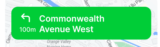
This is an example of how to customize the colors of banner instructions in the Navigation SDK. The example shows four attributes that can be used to change the appearance of the instructions banner displayed during navigation: navViewBannerBackground, navViewBannerPrimaryText, navViewBannerSecondaryText, navViewBannerManeuverPrimary.

The navViewBannerBackground attribute is used to specify the background color of the banner. navViewBannerPrimaryText is used to set the color of the primary text, which is typically the name of the street or road the user is currently on. navViewBannerSecondaryText is used to set the color of the secondary text, which is typically the distance until the next maneuver. navViewBannerManeuverPrimary is used to set the color of the maneuver icon, which is typically an arrow pointing in the direction of the next maneuver.

No.Attribute NameImpacted Property
1navViewBannerBackgroundcolor
2navViewBannerPrimaryTextcolor
3navViewBannerSecondaryTextcolor
4navViewBannerManeuverPrimarycolor
customize-banner-detail.png

For example, you can set the background color of the banner to white, the primary text color to black, the secondary text color to gray and the maneuver icon color to blue.

No.PropertyAttribute NameReference
1Primary Step TextnavViewBannerPrimaryTextCommonwealth Avenue West
2Maneuver IconnavViewBannerManeuverPrimaryTurn left icon
3Distance TextnavViewBannerSecondaryText100m
4Background ColornavViewBannerBackgroundWhite

Customize the colors of the bottom summary and instructions list

This example is customizing the colors of the bottom summary and instructions list in the Navigation View.

customize-navigation
No.PropertyAttribute NameReference
1Time Remaining TextnavViewPrimaryText1 min
2Distance Remaining TextnavViewSecondaryText0.5km
3Arrival Time TextnavViewSecondaryText17:56
4Instruction List Background ColornavViewBannerBackgroundWhite
5Step Primary TextnavViewListPrimaryDunearn Road
6Step Distance TextnavViewListSecondary150m
7Instruction List Maneuver PrimarynavViewListManeuverPrimary
8Instruction List Maneuver SecondarynavViewListManeuverSecondary

Change the base map’s style

To configure the base maps’ style is straightforward, simply add the styleable attribute below to our style.

The attribute "navViewMapStyle" is used to customize the style of the base map displayed in the navigation view. The format is a string, which refers to the Mapbox's Style URL (https://docs.mapbox.com/help/glossary/style/).

1
<attr name="navViewMapStyle" format="string"/>

In the example, your navViewRouteStyle is being set to a string reference of your map style. This allows developers to easily switch between different map styles by changing the value of this attribute in their app's styles.

1
<style name="your style">
2
...
3
<item name="navViewMapStyle">a reference of your style(string value)</item>
4
...
5
</style>

© 2024 NextBillion.ai all rights reserved.