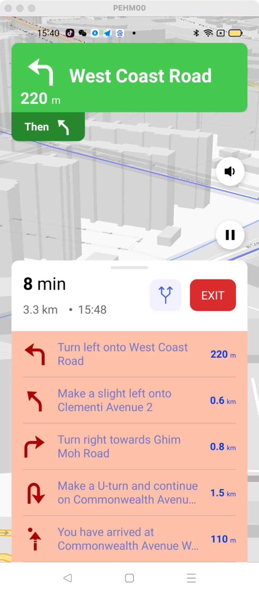
Customize styling of the Navigation Instruction List
This example shows:
-
How to customize the styling of the Navigation Instruction List
-
navViewListBackground
-
navViewListPrimary
-
navViewListSecondary
-
navViewListManeuverPrimary
-
navViewListManeuverSecondary
-
-
How to config custom navigation style using NavLauncherConfig.Builder

For all code examples, refer to Navigation Code Examples
activity_custom_instruction_list_style.xml view source
themes.xml view source
CustomInstructionListStyleActivity view source
Code Highlights
The key part of the code is the definition of two theme styles: Theme_CustomNavInstructionList and Theme_CustomNavInstructionListDark. These styles are based on the NavigationViewLight and NavigationViewDark styles, respectively. They are used to customize the appearance of the navigation instruction list in the navigation view. Here is a more detailed explanation of each style:
-
Theme_CustomNavInstructionList: This style is used to customize the appearance of the navigation instruction list in light mode. It changes the background color, text color, and font size of the list.
-
Theme_CustomNavInstructionListDark: This style is used to customize the appearance of the navigation instruction list in dark mode. It changes the background color, text color, and font size of the list.
These styles can be used to change the appearance of the navigation instruction list to match the overall style of the app. For example, if the app is using a light theme, the Theme_CustomNavInstructionList style can be used to make the navigation instruction list white with black text. If the app is using a dark theme, the Theme_CustomNavInstructionListDark style can be used to make the navigation instruction list black with white text.
Code summary
Definition of Theme.CustomNavInstructionList:
-
It is a custom style that extends the NavigationViewLight style.
-
It allows customization of the navigation instruction list appearance.
-
The following items are defined within this style:
-
navViewListBackground: Specifies the background color of the navigation instruction list.
-
navViewListPrimary: Specifies the primary text color of the navigation instruction list.
-
navViewListSecondary: Specifies the secondary text color of the navigation instruction list.
-
navViewListManeuverPrimary: Specifies the primary color for maneuver icons or visuals in the navigation instruction list.
-
navViewListManeuverSecondary: Specifies the secondary color for maneuver icons or visuals in the navigation instruction list.
-
The Theme.CustomNavFloatingButtonsDark style is similar to the previous style but is based on NavigationViewDark.
configBuilder.lightThemeResId(R.style.Theme_CustomNavInstructionList) sets the light theme for the navigation UI, using the Theme_CustomNavInstructionList style defined earlier. This style determines the appearance of the floating buttons in the navigation view.
configBuilder.darkThemeResId(R.style.Theme_CustomNavInstructionListDark) sets the dark theme for the navigation UI, using the Theme_CustomNavInstructionListDark style defined earlier. This style is applied when the device's dark mode is enabled.
Besides, the action after clicking the fetch route button shows how to fetch a route using NBNavigation.fetchRoute(origin, destination, new Callback<DirectionsResponse>() { ... }); The origin and destination points are passed as parameters, along with a callback to handle the response asynchronously.


